Woodcraft Folk Brand
When you’re sending communications out on behalf of Woodcraft Folk (whether it’s Folk Office, a centre or your local group or district), we advise that you adhere to our brand guidelines document which can be found here. You can also download a folder via this link which includes variations of our logo. Below details some simple steps you can follow to help us become better known and understood as an organisation.
1. Use our name consistently
When talking about Woodcraft Folk use our full name. ‘Woodies’, ‘The Folk’, ‘Woodcraft’ might be understandable to those who are already involved, but using ‘Woodcraft Folk’ whenever we are writing or talking about our organisation will help more people to understand that we’re all part of the same thing.
2. Format your text
Woodcraft Folk use two core fonts, Montserrat and Poppins Bold. Our brand identity requires a consistent and correct use of the fonts.
For the main text of your email, flyer or letter, use Montserrat in its regular weight. In most cases you want a font size of 11 or 12pt. We use this font as it is a standard font on the Google Suite, as well as being supported by web browsers and email clients. This means that most people will be able to both create and view text in this font. It should look the same for the recipient as when you write it, even when you use different systems.
For headlines use Monserrat Bold (select the font Monserrat and then apply bold formatting in most word processing software). You want to make titles stand out, so use 14pt for main headings and 12pt for sub-headings. You can also use bold in the text to emphasise key points.
For titles use Poppins Bold.
3. Use an up-to-date logo
You can download a folder containing Woodcraft Folk’s logos in the side panel on this web page.
We’ve made subtle changes to the logo over the years, with the most recent design created in 2011 following a branding project mandated by Annual Gathering. It helps us to be better known and understood if we all use the same logo. Below shows the version of the logo that we’d like everybody to be using. It comes in three variations:
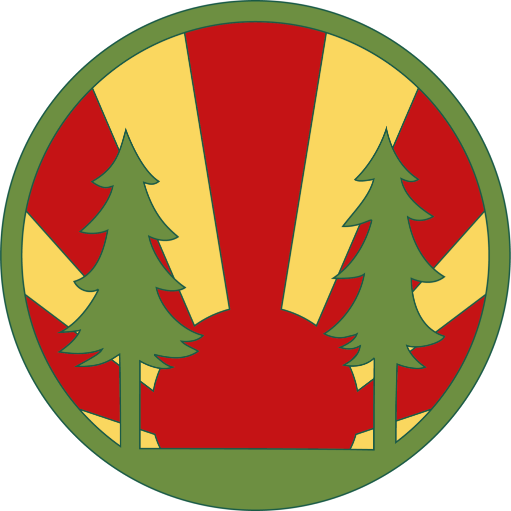

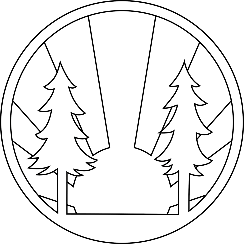
As you can see, it comes in colour, black & white, and outline versions depending on where you are using it. If you will be printing in colour or your communication will only be viewed on screens, use the colour version. If you need to print in black & white, or you’re overlaying the logo onto a vibrant photo or other strong coloured background for a publication, a single colour version of the logo will work better.
The logo should appear at least once in each document or communication, but it definitely shouldn’t appear more than once on the same page. If the communication is going mostly to non-members e.g. a flyer to promote a group or a letter to an MP or newspaper, then you should always use the logo accompanied by the organisation name and strapline. Variations of the logo accompanied with the strapline can be found in the side panel on this page where you can download a folder with most versions of the logo.
A logo option should be chosen based on which variation makes the logo stand out the clearest and most prominent as well as taking into account communication type and audience.
The brand guidelines document in the side panel details more info on logo use and application.
If you need to resize the logo to fit your publication, make sure the logo isn’t distorted and remains it’s circular form. If it is enlarged to the point of becoming pixelated, get in touch with info@woodcraft.org.ukand we can supply the file at a larger resolution. For professional print quality, you can use a vectorised .EPS version of the logo, however this isn’t compatible with all word processing software. If you require an .EPS logo please contact info@woodcraft.org.uk. The Communications Team can also supply versions of the logo on a transparent background if you want to overlay it on backgrounds/photos. Please email info@woodcraft.org.uk if you could like a copy of these.
4. Use a good picture
One of the challenges with communications that members raise a lot, is that our name and logo don’t tell people exactly what we do. That might change in the future, but for now the best thing to do is use photos wherever possible that show what we have to offer. Using strong imagery in communications grabs attention and is an opportunity to create a feel for what Woodcraft Folk stands for.
If you are creating a flyer for a group, sending out an email about an event, or creating a publication, try to lead with images that are relevant to what you are talking about. As a minimum they should be:
- In focus
- Of a high enough resolution so they’re not pixelated
- In full colour (unless you have to print in black and white)
- Credit any creator if it is required
Remember we are a charity for children and young people, so in most circumstances the most appropriate image will be of a children and young people taking part in activities. You need to make sure appropriate permissions have been sought from the people in the photo or their parents/guardians for it to be used for publicity purposes.
If your want to use any image that is not created by yourself you must have permission to use it for the intended purpose.
If you’re trying to promote a specific event or opportunity, think about whether that image would make you want to attend. Do the attendees look like they’re enjoying the training? Is the image showing the most attractive activities that take place on camp? If you’re setting up a new group or trying a new activity for the first time, you can ask Folk Office or neighbouring groups and districts if they have an image that you could use.
Woodcraft Folk have an image library so if you are struggling for a photo, please contact us at info@woodcraft.org.uk and we will do our best to find an image to match your needs.
5. Colour palette
Woodcraft Folk have a bright and engaging colour palette which is to be used for communications and publicity material. To find out more about Woodcraft Folk’s colour palette, please read the brand guidelines.
6. Further info
If you need help with branding or communications, do get in touch info@woodcraft.org.uk